SaaS Application UI/UX Design: Building Scalable, Multi-Tenant Software Systems
Table of contents
- What Makes SaaS Applications Different?
- Design Considerations for Scalable SaaS Applications
- 1. Design for many organizations
- 1.1 Build for configuration
- 1.2 Design sensible defaults
- 1.3 Consider white-labeling from the beginning
- 1.4 Resist adding settings for every request
- 1.5 Accommodate different organizational maturity levels
- 2. Design for multiple user roles and access levels
- 2.1 Design for responsibilities
- 2.2 Design permission-aware interfaces
- 2.3 Account for users with multiple roles
- 2.4 Plan for changing permissions
- 3. Build interfaces that can grow with your product
- 3.1 Plan your information architecture for growth
- 3.2 Group features by user goals
- 3.3 Treat search as part of the navigation experience
- 3.4 Build reusable components and interaction patterns
- 3.5 Design with real data in mind
- 3.6 Consider accessibility as the product grows
- 4. Design for global audience
- 4.1 Design for translation
- 4.2 Think beyond left-to-right layouts
- 4.3 Avoid assumptions about regional conventions
- 4.4 Consider cultural expectations
- 5. Design for complete workflows
- 5.1 Understand the entire workflow
- 5.2 Reduce unnecessary context switching
- 5.3 Allow users to become more efficient over time
- 5.4 Help users recover from interruptions
- 5.5 Design for both individuals and teams
- 5.6 Measure success by completed work
- 6. Design for continuous evolution
- 6.1 Preserve familiarity while introducing change
- 6.2 Design for migration
- 6.3 Make changes discoverable
- 6.4 Manage UX debt alongside technical debt
- Conclusion
- Working On a SaaS Product?
In contrast to custom software built for a single client, a SaaS product must support diverse organizations and workflows within one codebase. Every new feature, integration, or permission level has to naturally fit into an interface already used by thousands of people daily.
This constraint makes SaaS UX/UI design fundamentally unique. The main challenge is to create interfaces that are easy to use today while building a foundation that can evolve as the product grows.
In this article, we will examine the core design principles required to help a SaaS platform scale.
Key takeaways
- Configuration is a more scalable approach than customer-specific customization.
- Growth should be anticipated from the beginning. Navigation layouts and UI components must be flexible enough to easily absorb new features and options.
- Different user roles should feel like different perspectives on the same product.
- Internationalization extends beyond translating text to adapting to regional formats, habits, and cultures.
- The quality of a SaaS product is reflected in how efficiently users complete their everyday work.
- Continuous product development requires ongoing UX refinement to keep the interface maintainable and usable.
What Makes SaaS Applications Different?
SaaS applications share a number of characteristics that influence both how they're built and how they're designed.
| Characteristic | What it means |
| Multi-tenancy | One application serves many organizations with different workflows, business rules, and operational needs. |
| Shared codebase | All customers use the same application with updates and new features delivered to everyone simultaneously. |
| Role-based access and permissions | Different users within the same organization have different responsibilities, permissions, and access to information. |
| Self-service adoption | Users are expected to learn and start using the product with little or no formal training. |
| Continuous delivery | The product evolves continuously through regular smaller releases. |
| Global availability | Customers may access the product from different countries, languages, and cultural contexts. |
| Collaborative and data-intensive workflows | Many SaaS applications support teams working together while managing large amounts of information. |
Design Considerations for Scalable SaaS Applications
Although every SaaS product has its own audience, goals, and level of complexity, the design challenges they face are often quite similar. The following considerations focus on the areas that help a SaaS interface support growth over time.
1. Design for many organizations
Because SaaS products must support multiple organizations, the interface must accommodate their differences without becoming fragmented or difficult to maintain.
Key takeaways:
- Configuration is more scalable than customer-specific customizations. Identify patterns behind requests and build flexibility into the product instead.
- Defaults deserve as much attention as configuration options. A feature that works well out of the box reduces the need for additional settings.
- White-labeling requires more than a logo swap. Build flexible components from the start to handle longer names, varied logos, and custom themes.
- Resist the urge to add a setting for every request. Each new option adds complexity. Sometimes improving the default is a better solution.
- Design for different organizational maturity levels. The interface should feel clean for small teams and expand to absorb complexity for larger ones without forcing separate applications.
1.1 Build for configuration
One of the easiest ways to make a SaaS product difficult to maintain is to start building customer-specific interfaces. A customer asks for an additional field, another for a different approval process, and soon the product quickly becomes a collection of one-off solutions that are expensive to develop, test, and maintain.
A better approach is to identify patterns behind these requests and ask a question: Can this become a configurable feature instead?
Instead of creating custom interfaces, allow organizations to configure workflows, statuses, columns, notifications, or dashboards within predefined boundaries. Give enough flexibility to adapt the product to the way they work while keeping a consistent interface for everyone else.
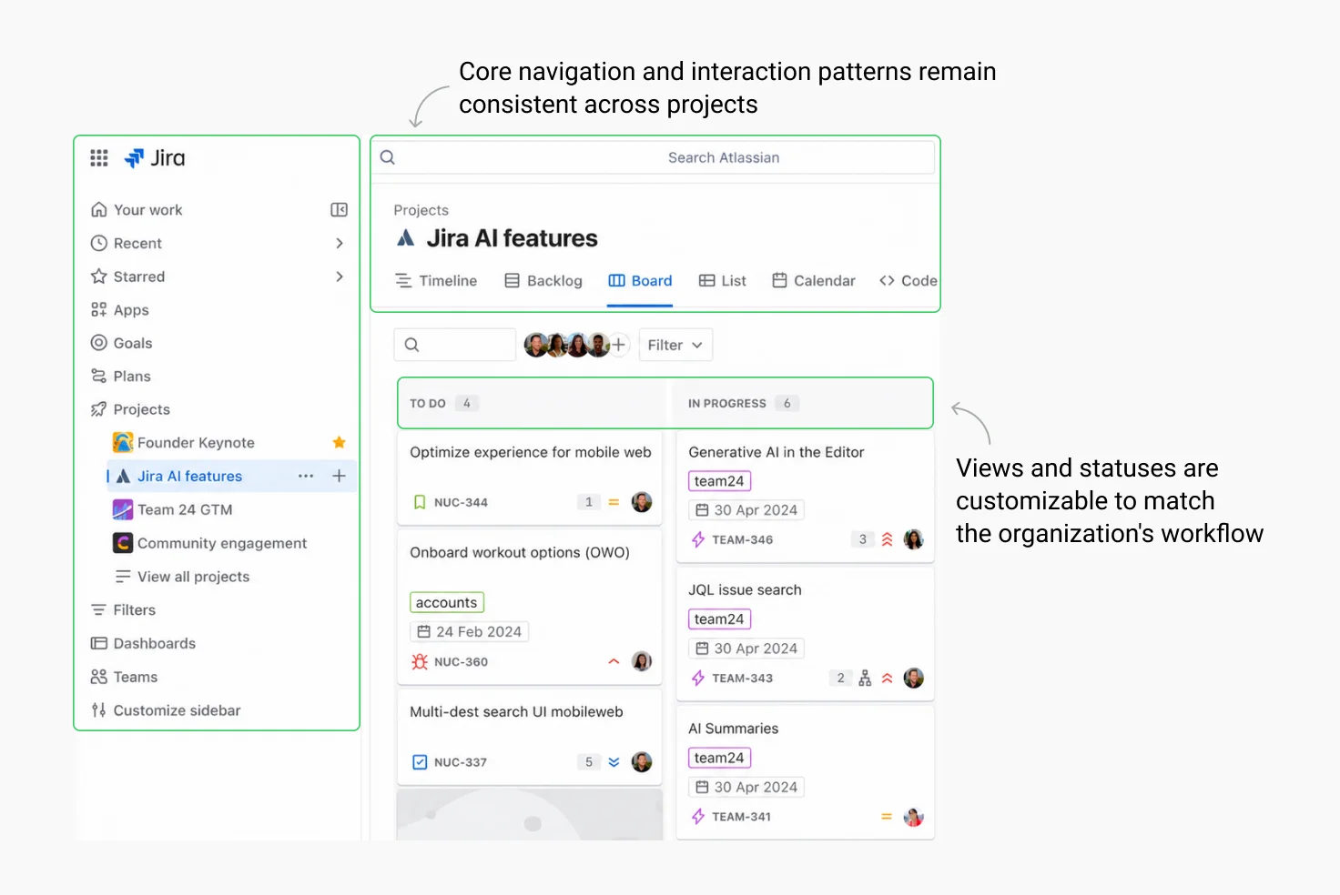
In Jira, organizations can configure workflows, issue types, fields, and permissions extensively, but the overall interaction model remains familiar across different instances. A user moving between two companies may encounter different processes but they still know how to navigate the product and complete everyday tasks.
1.2 Design sensible defaults
Every SaaS application should work well with little or no configuration. Most organizations never change every available setting, and many smaller customers simply accept the defaults. Those defaults therefore deserve just as much design attention as the configuration options themselves.
When evaluating a new feature, ask:
- Would this work well if nobody changed a single setting?
- Would a small company understand how to use it without an administrator?
- Does configuration solve a real business need or compensate for a weak default?
In many cases, improving the default experience removes the need for additional settings altogether.
1.3 Consider white-labeling from the beginning
SaaS products that need white-label capabilities should account for them early. Branding goes beyond swapping a logo and changing the primary color. Longer company names may affect navigation, different logos require flexible layouts, and custom themes need to preserve accessibility and visual hierarchy.
Supporting multiple brands becomes much easier when visual customization is built on a consistent and reusable component system. A well-designed button should continue to work regardless of whether the customer's brand color is blue, green, or orange. And navigation should remain usable even if the organization name is twice as long as expected.
1.4 Resist adding settings for every request
Every customer request seems small in isolation (“Can we have a setting to hide this widget?”), but eventually hundreds of small requests become hundreds of switches. Every new setting increases complexity. Someone has to understand, configure, document, test, and support it.
Before introducing another option, ask whether the problem affects many organizations or only a handful. Sometimes the better solution is improving the default behavior instead of adding another preference. Reserve configuration for genuine differences between organizations.
1.5 Accommodate different organizational maturity levels
Some customers expect API integrations, automation, and advanced reporting from day one; while others are replacing spreadsheets for the first time. A scalable SaaS product should support both without forcing them into separate applications.
This requires an interface that expands nicely alongside a company's operations. For smaller teams, the workspace should feel clean and focused on core tasks. For more mature teams, the system should absorb their structural complexity without cluttering the day-to-day layout for their front-line staff.
2. Design for multiple user roles and access levels
Enterprise SaaS products serve everyone from administrators to front-line operators. The interface must dynamically adapt to match each user's specific permissions and daily tasks.
Key takeaways:
- Design around responsibilities. Responsibilities are more stable across organizations than role names and titles.
- Permissions should simplify the interface. Users should see only what's relevant to them without wondering if something is broken.
- Support users with multiple roles. Permission models should allow responsibilities to combine without creating confusion.
- Plan for changing permissions from the start. Transitions should feel natural, and administrators should be able to manage access without unnecessary complexity.
2.1 Design for responsibilities
One mistake teams often make is designing interfaces around organizational charts. The problem is job titles don’t translate well across companies. One organization's "Manager" may perform the same tasks as another organization's "Administrator," while smaller companies often have a single person responsible for many tasks.
Think instead in terms of responsibilities. Ask questions such as:
- Who configures the product?
- Who performs daily operational tasks?
- Who approves changes?
- Who only needs to review reports?
- Who manages other users?
Responsibilities remain relatively stable regardless of job titles. Designing around them produces interfaces that are easier to adapt across different organizations.
2.2 Design permission-aware interfaces
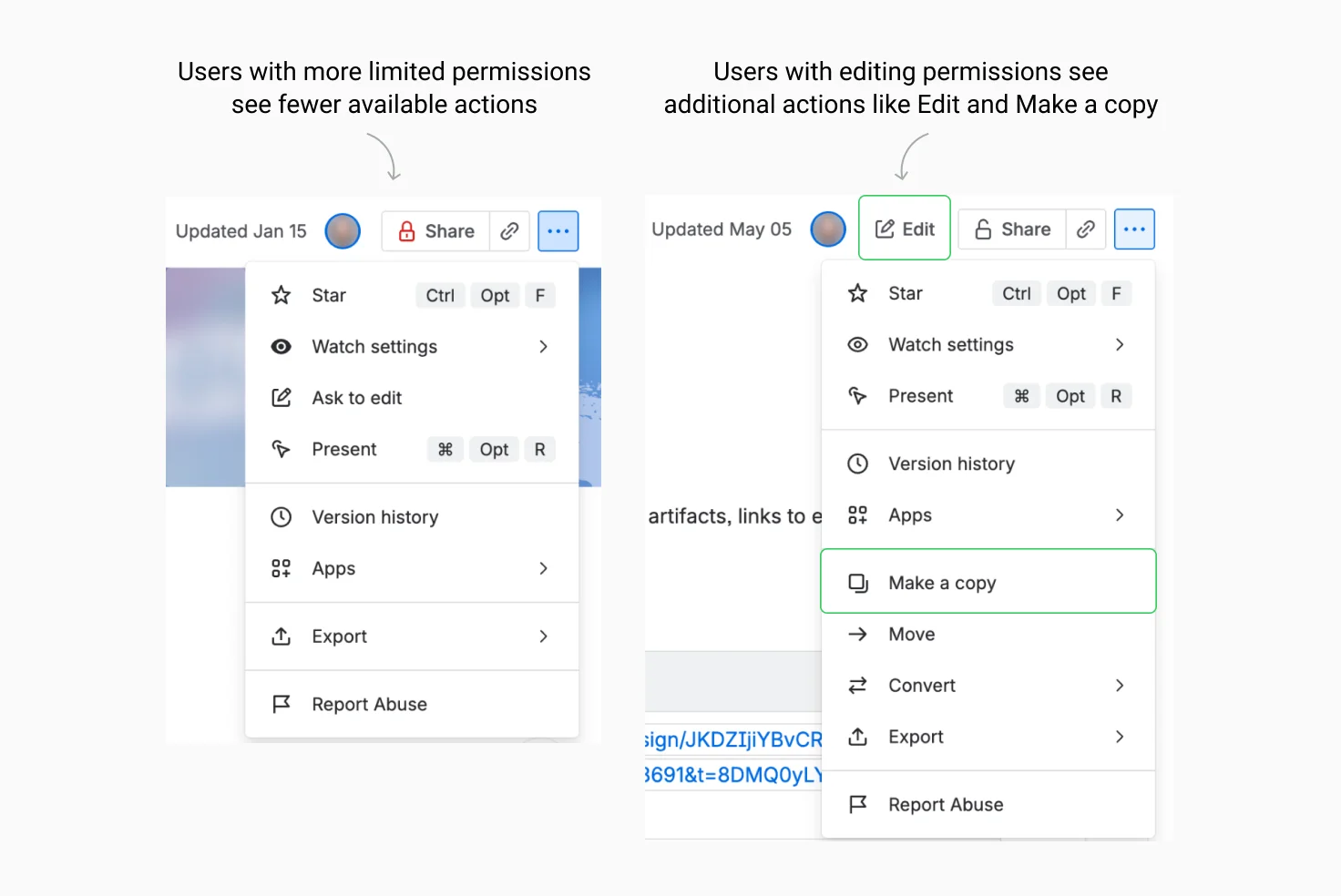
Different users require different tools, information, and levels of access. The interface should reflect those differences in a way that feels predictable and easy to understand. Users should always have a clear understanding of what they can and cannot do, without wondering whether something is broken or simply unavailable to them.
Confluence provides a good example of this approach. As a user's role changes, the interface adapts by exposing different actions and capabilities while preserving the same overall structure and navigation. This allows people to focus on the tasks relevant to their responsibilities without making the product feel unfamiliar when their permissions change.
2.3 Account for users with multiple roles
In many organizations, a department manager might also approve expenses and an IT administrator may occasionally process support tickets. Avoid assuming that users belong to exactly one category and create interfaces that allow responsibilities to be combined. Permission models should support multiple roles without producing conflicting navigation or duplicated functionality.
This becomes especially important in growing organizations and startups, where responsibilities evolve much faster than the software itself.
2.4 Plan for changing permissions
Employees join, change departments, receive promotions, or leave the company. Teams get reorganized. A well-designed SaaS product should handle these transitions nicely.
Users should immediately understand what has changed when their permissions are updated. New capabilities should feel like a natural extension of the existing interface. Likewise, administrators should be able to assign and review permissions without navigating through unnecessarily complex settings. Define the permission model from the start to minimize mistakes that can lead to security or support issues.
3. Build interfaces that can grow with your product
SaaS products evolve continuously to meet new customer demands. Designers must find ways to integrate new tools and workflows without cluttering the layout or confusing the user. Balancing this ongoing expansion with keeping the product easy to use is arguably the biggest challenge in SaaS design.
Key takeaways:
- Plan navigation for growth from the start. Reorganizing later forces users to relearn the product.
- Group features by user goals instead of engineering structure. Navigation should reflect how people think about their work.
- Search complements navigation. Menus help users discover, search helps them move quickly.
- Reusable components make scaling easier. Consistency reduces learning effort and prevents design debt.
- Test with real data early. Placeholders hide usability problems that only appear with realistic content.
- Build accessibility from the beginning. Retrofitting later is more expensive and less effective.
3.1 Plan your information architecture for growth
One of the most common mistakes is treating navigation as something that can always be reorganized later. But once users become familiar with where things are, every change comes at a cost. Moving features between menus may improve the overall organization, but it also forces existing users to relearn parts of the product.
Rather than thinking only about today's features, consider how the navigation might evolve over the next few years. Leave room for new modules, related functionality, and entirely new workflows. Keeping a navigation structure a bit spacious today allows for expansion later.
3.2 Group features by user goals
Imagine a product that contains separate pages for "Invoices," "Payments," "Refunds," and "Tax Rules." From an engineering perspective these may be separate systems. From the user's perspective, they are all part of managing company finances. Navigation should reflect how people think about their work rather than how the application is built internally.
A useful exercise is to ask users where they would expect to find a feature before showing them the interface. If the answer differs from where the product currently places it, the information architecture may need reconsideration.
3.3 Treat search as part of the navigation experience
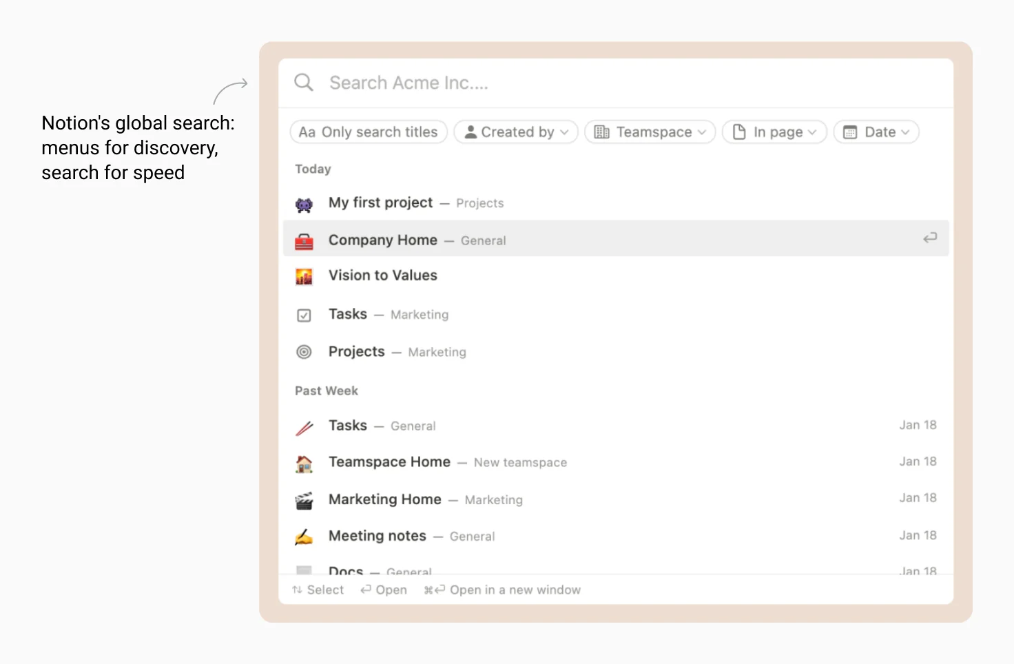
As SaaS products grow, navigating exclusively through menus becomes less efficient. Users begin relying on search to locate projects, documents, settings, teammates, or commands without remembering exactly where each item lives. Search becomes an essential complement to navigation, especially for experienced users who value speed over browsing.
Well-designed products like Notion treat navigation and search as complementary tools. Navigation helps users understand the product's structure and discover available functionality, while search provides a faster route to known destinations.
3.4 Build reusable components and interaction patterns
Establishing reusable components and interaction patterns helps prevent inconsistencies. When users learn how one table, filter, or settings page behaves, they should be able to apply that knowledge elsewhere in the product. If your team needs expert help in creating such scalable frameworks, professional design services can ensure your product's foundation is built correctly from day one.
Consistency reduces learning effort and makes future features easier to design. Reusable components and shared interaction patterns also allow teams to expand without repeatedly solving the same design problems, making the interface easier to scale as new functionality is introduced.
3.5 Design with real data in mind
When you design for and test with placeholder content only, it creates a false sense of confidence. Whenever possible, design and review interfaces using realistic datasets. Include unusually long names, incomplete records, different languages, and large collections of information. Many usability problems only become visible when the interface is exposed to the kind of data real customers produce.
3.6 Consider accessibility as the product grows
As SaaS products evolve, accessibility becomes increasingly difficult to retrofit. Every new feature, component, and interaction introduces another opportunity for inconsistent keyboard support or insufficient color contrast. Addressing these issues across a mature product is significantly more expensive than establishing accessible patterns early.
Treat accessibility as part of the product's foundation. It benefits many everyday situations beyond permanent disabilities. Users may rely on keyboard navigation, work in bright environments, or use the application on devices with different input methods. Designing accessible components from the beginning creates a more resilient interface as the product continues to grow.
4. Design for global audience
Global expansion requires supporting diverse languages, regional conventions, and cultural differences. Planning for these localization constraints from the beginning prevents expensive changes when entering new markets.
Key takeaways:
- Design for text expansion from the start. Translated content can take significantly more space than English.
- Plan for right-to-left layouts early. RTL impacts more than text. Navigation, icons, progress indicators, and page structure all need mirroring.
- Avoid assumptions about regional conventions. Dates, currencies, names, and addresses can vary widely across markets.
- Validate cultural assumptions before they become permanent. Colors, icons, and terminology may carry different meanings in different regions.
4.1 Design for translation
One of the first surprises teams encounter is that translating an interface affects much more than the text itself. Some languages require considerably more space or less space than English. For example, the English button label "Save" often becomes "Speichern" in German or "Guardar" in Spanish. Across dozens of components, these differences quickly add up.
Leave enough room for translated content from the beginning. Make sure components and layouts can accommodate different text lengths without breaking the interface.
4.2 Think beyond left-to-right layouts
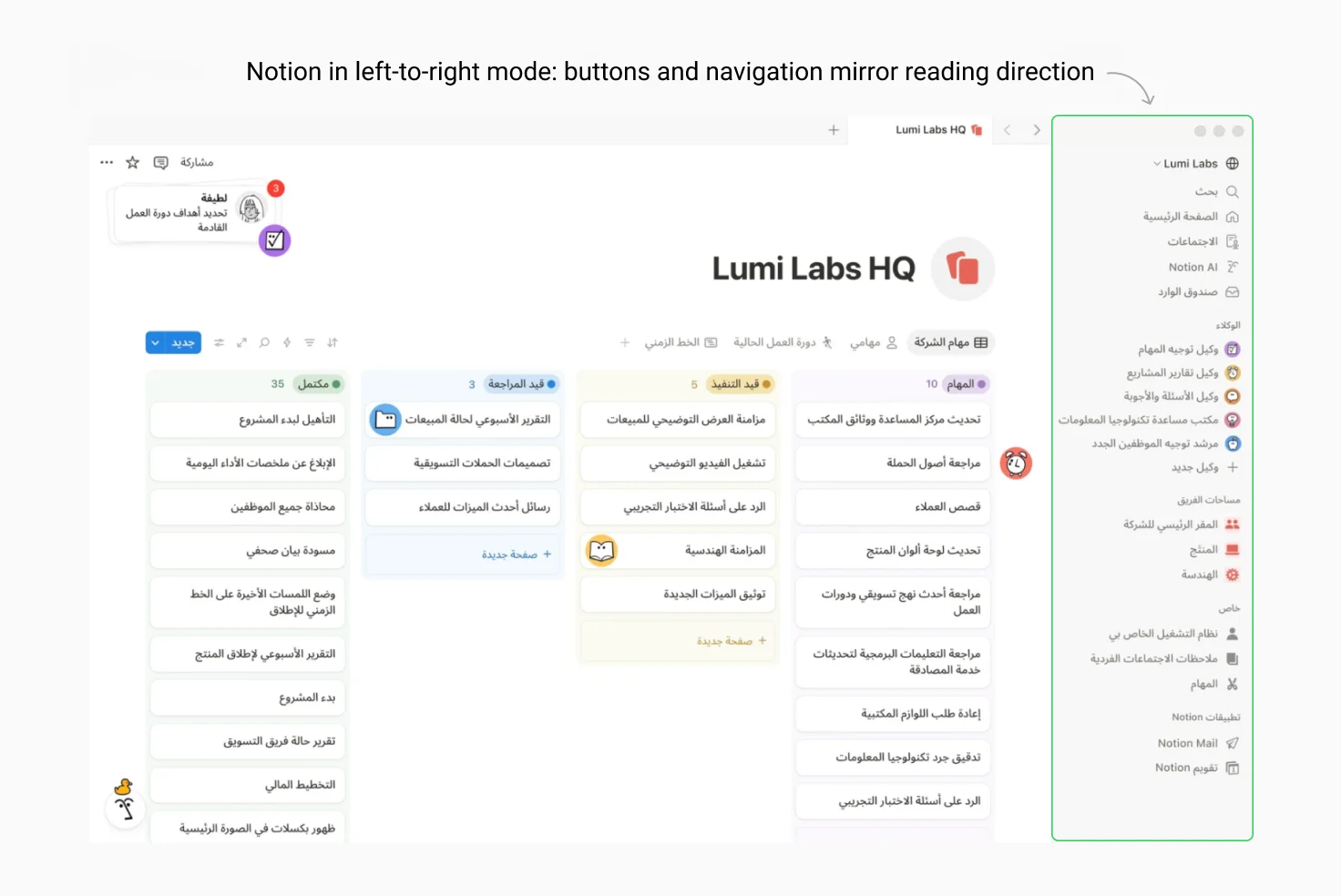
Languages with the righ-to-left reading order (such as Arabic and Hebrew) affect more than text alignment. Navigation, icons that imply direction, progress indicators, breadcrumbs, and page layouts often need to mirror the reading direction.
The important point is consistency. When an interface supports right-to-left layouts, users expect the experience to feel native rather than like an English interface that has simply been translated. Planning for bidirectional layouts early is considerably easier than changing them once hundreds of screens have already been designed.
4.3 Avoid assumptions about regional conventions
Dates, time formats, currencies, measurements, and even names are interpreted differently around the world. A date written as 03/04/2026 could mean March 4 or April 3 depending on where the user lives. Phone numbers, postal codes, addresses, and personal names also vary considerably between countries. Assuming that every customer has a first name, last name, ZIP code, and state often works well until the product reaches a market where those concepts do not exist.
Whenever possible, rely on localization libraries and regional standards. Don’t invent custom formats unless it’s absolutely necessary. Small details like these never attract attention when implemented correctly but can quickly become frustrating when they are not.
4.4 Consider cultural expectations
Design conventions are not entirely universal. Colors, icons, imagery, illustrations, and even terminology may carry different meanings in different regions. Business terminology also varies. The same concept may be referred to as a "client," "customer," "account," or "organization" depending on the industry and region.
This does not mean every market requires a completely different interface. It does mean, however, assumptions should be validated before becoming permanent design decisions.
5. Design for complete workflows
Users judge software by how efficiently it handles actual work. A polished layout still fails if it disrupts the broader user workflow or adds unnecessary steps to a task.
Key takeaways:
- Understand the entire workflow before designing individual screens. Map the full journey and look for opportunities to simplify across the whole experience.
- Reduce unnecessary context switching. Allow users to complete common actions without leaving their current view.
- Support both beginners and power users. Keyboard shortcuts, command palettes, and bulk actions let experienced users move faster without overwhelming newcomers.
- Help users recover from interruptions. Drafts, autosave, recently viewed items, and persistent filters make it easy to pick up where they left off.
- Design for both individuals and teams. Collaboration features like comments, mentions, and activity history should be integrated into the workflow.
- Measure success by completed work. Measure success by completed work. Track what users actually finish, where they struggle, and what makes them abandon tasks.
5.1 Understand the entire workflow
A user creating a purchase order rarely thinks about which screen they are currently on. Their focus is on completing a task. Understanding the full workflow often shows opportunities to simplify the experience: presenting together information that previously required opening several pages or grouping related tasks into one workspace.
Map the entire journey that surrounds a screen before designing it and look for opportunities to improve it. Resist infinitely polishing each individual page.
5.2 Reduce unnecessary context switching
Every time users leave their current task, they need to rebuild their mental context when they return. Opening a separate page to edit a simple property or navigating away to check related information during a single task increases cognitive effort.
This does not mean everything belongs on one screen. Consider instead whether users can complete common actions without unnecessarily leaving their current context.
For example, Asana lets users edit task details in a slide-out panel that keeps the full project view visible behind it. Reducing context switching helps users maintain focus, especially during repetitive work.
5.3 Allow users to become more efficient over time
People's relationship with a SaaS product changes over time. New users benefit from guidance, clear labels, and visible actions. Experienced users often value speed and efficiency. Don’t force everyone through the same experience and allow the interface to support both.
Keyboard shortcuts, bulk actions, saved filters, templates, quick actions, and command palettes can dramatically improve efficiency for experienced users without making the interface more difficult for newcomers.
Products like Linear, Notion, and GitHub all invest heavily in these productivity features because many of their users spend several hours a day inside the application. The goal is to allow users to become more efficient naturally as they gain experience.
5.4 Help users recover from interruptions
Users don’t always complete their work in one session. They open a different tab because a meeting starts or they go to launch at noon. Interfaces should make it easy for them to continue where they left off.
Features such as drafts, autosave, recently viewed items, persistent filters, and activity history reduce the frustration of interrupted work. They also make the product feel more reliable because users know their progress will not disappear. Such features become especially valuable when workflows become longer and more complex.
5.5 Design for both individuals and teams
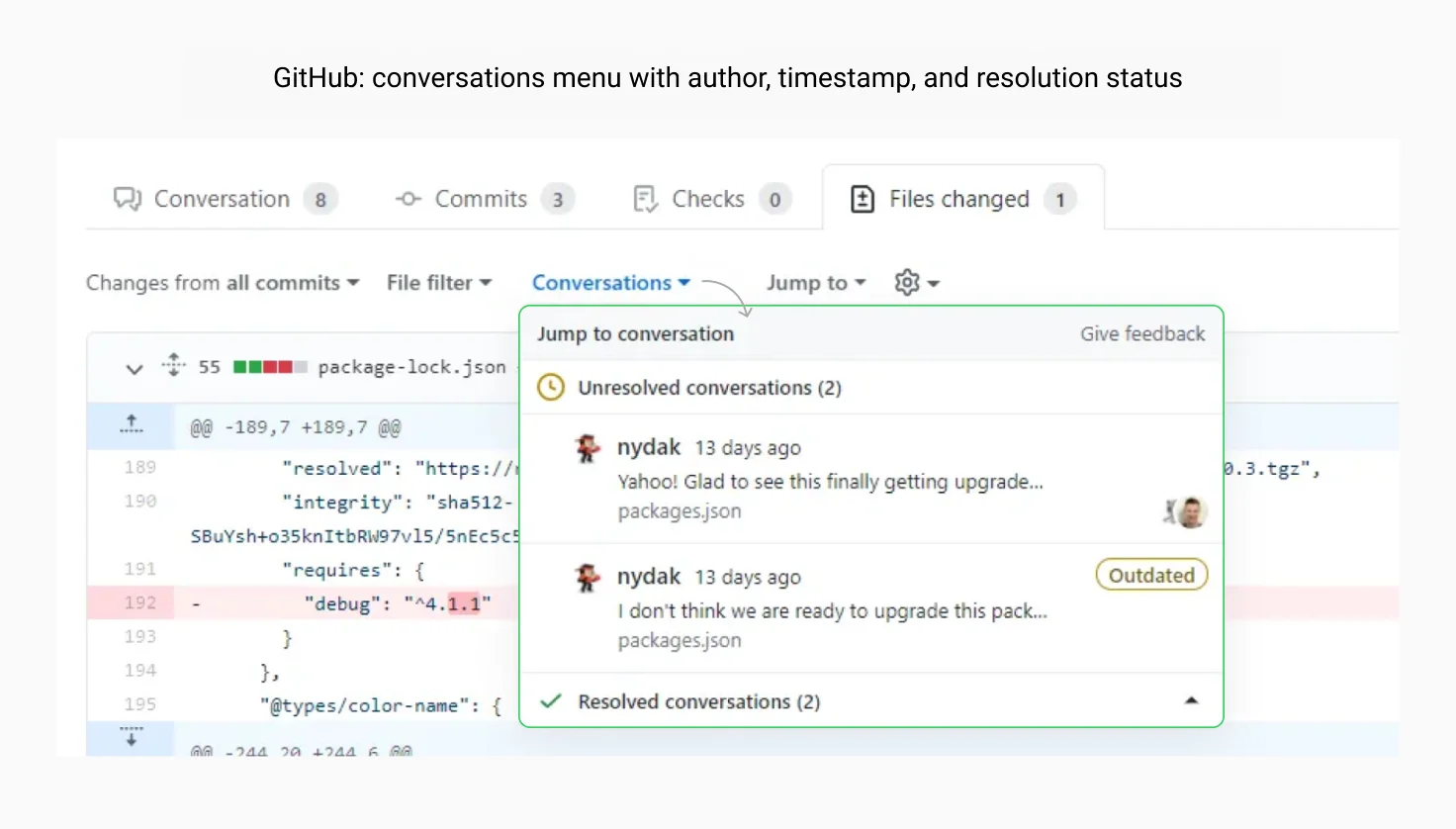
Many SaaS products support collaborative work through features like assigning tasks, writing comments, and concurrent editing. A workflow should make these transitions obvious. Users should be able to answer questions such as:
- Who is responsible for this?
- When was it changed?
- What exactly changed?
- Who approved it?
- What still requires attention?
Features like activity history, comments, mentions, assignment indicators, and notifications help people coordinate their work without relying on external communication channels. Figma and Github is a good example of how collaboration becomes part of the daily workflow and doesn’t force users to switch to separate chat apps or messengers.
5.6 Measure success by completed work
Good SaaS products aim at making everyday work easier to complete. Look at the complete workflow and ask the following questions:
- How many steps does the task require?
- Where do users hesitate?
- Which actions are repeated unnecessarily?
- Where do people abandon the process?
Metrics such as task completion rate, time to complete common workflows, error frequency, or support requests can help reveal more about the quality of the user experience and ways to make it superior.
6. Design for continuous evolution
SaaS products face a constant tension between growth and stability. As new features roll out regularly, existing customers still expect a familiar, reliable workspace. The challenge is balancing ongoing product growth with everyday ease of use.
Key takeaways:
- Preserve familiarity when introducing change. Build new functionality on patterns users already understand. Small, incremental changes are easier to adopt.
- Design for migration alongside new features. Old and new workflows should coexist temporarily, giving users time to adjust.
- Make changes discoverable without forcing tours. Use contextual hints for minor updates and lightweight modals for critical changes.
- Manage UX debt alongside technical debt. Regular UX reviews and design system maintenance prevent small inconsistencies from fragmenting the experience.
6.1 Preserve familiarity while introducing change
People build habits. They remember where features are located and how workflows are organized. Even well-intentioned redesigns can disrupt those habits if they introduce unnecessary changes.
When adding new functionality, build it upon patterns users already understand whenever possible. If filters always appear in a side panel, continue using that pattern. If primary actions consistently appear in the same location, avoid moving them simply because a page has been redesigned. Small, incremental changes are often easier for users to adopt.
6.2 Design for migration
Every successful SaaS product eventually replaces something. This transition from legacy deserves as much design attention as the new feature.
Instead of removing familiar functionality overnight, consider how existing customers will adapt. Can the old and new workflows coexist temporarily? Can users clearly see what has changed and why? And are they given enough time to adjust before older functionality disappears?
A migration strategy is part of the user experience. Well-managed transitions reduce the risk of disrupting customers' daily work.
6.3 Make changes discoverable
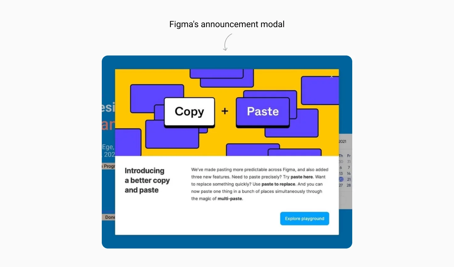
Users don't appreciate forced onboarding tours. Whenever possible, introduce new functionality contextually when it becomes relevant to what users are doing. Minor improvements can be announced with a subtle "New" badge or a tooltip. Critical changes like a major new feature or a workflow change deserve a lightweight, dismissible modal.
Figma handles this well. Minor updates appear as contextual hints. Major features get a "What's New" modal. Users learn without interruption, and they stay in control of when they explore.
6.4 Manage UX debt alongside technical debt
Technical debt is a familiar concept in software development. User interfaces accumulate debt in much the same way although it often receives much less attention.
As a SaaS product grows over several years, different teams inevitably stack new features onto layouts that were never originally designed to hold them. Individually, these temporary workarounds and layout tweaks seem minor. Over time, however, they make the software harder to navigate, maintain, and learn.
UX debt is often invisible until users begin noticing that similar tasks work differently across the product. Regular UX reviews, design system maintenance, and periodic refinement help prevent these small things from accumulating and fragmenting the experience.
Conclusion
Designing a successful SaaS application goes beyond creating attractive interfaces and following established UX principles. Every design decision should account for the realities of multi-tenancy, diverse user roles, continuous product evolution, and long-term scalability.
There is no single formula that works for every SaaS product. A project management platform, a healthcare application, and a financial system will each have different priorities, users, and constraints. However, the most successful products establish a solid foundation early and leave room for the product to grow without making it harder to use.
Working On a SaaS Product?
Designing a scalable SaaS product involves making many decisions about navigation, permissions, configuration, workflows, and component architecture. The quality of those decisions affects how well the product will support new customers and years of continuous development.
Our product discovery and UX teams help organizations make these decisions. Through user research, workflow analysis, UX architecture, prototyping, and design systems, we help teams validate ideas, uncover usability issues, and build products that remain easier to extend as they grow.
If you're planning a new SaaS platform or evolving an existing one, we'd be happy to discuss your product and the challenges you're trying to solve.
Published on Jul 22, 2026