Designing Solutions for Healthcare: How to Make Users of Your App Satisfied?
Table of contents
Every product owner places a great emphasis on its functionality, and for good reason. When a product is incapable of delivery, it’s a waste of money. Still, it’s not just about functionality. The thing is that all functions have to be presented in the way to be easily understood and utilized by end-users — and this is achieved through sound design.
When it comes to healthcare apps, design plays one of the major roles in lead generation, customer loyalty, and retention rates. Any successful healthcare app has to be built in a way to highlight the most essential elements of the product, gently guide users through its features and functions, give advice on the next step to take, and in this way lead to necessary actions. When it does, the app can serve a company as its main product and pay for investments.
This post aims at sharing key steps that need to be taken for the creation of a worthy healthcare app. All of them derive from our development expertise that covers the creation of solutions for companies operating in the healthcare industry. Furthermore, the article features information about the recent development of a migraine app, so make sure to learn about the benefits offered to a client after the work done by our team, and see how our services can contribute to your product success and increased profits.
Designing mobile apps for healthcare: key steps to take
It’s true that the competitiveness in the healthcare app market is severe, so deficiencies are unacceptable. In case your users, whether these are your employees or clients, face some difficulties when they interact with your solution, you’re in trouble: productivity of your workers will decrease, and you will lose your customers who’ll find another, more satisfying solution. To help you avoid such situations, we provide you with initial steps to take for the creation of a sound healthcare app design.
Step #1: Research
Before prototyping an app interface, you need to define your target audience: their geographical, socio-demographic, psychological characteristics, etc. — anything that is correlinked with your product goal. Remember that there’s no product that can fit everyone. And while interests and capabilities of users play significant roles in how your users will interact with the application, start with answering the following questions:

Also, you have to think about whether your app will be used by patients, their doctors, or both. This will allow you to make smart decisions about functionality and UI.
When it comes to medical personnel, your app should provide them with the ability to find data quickly. These could be electronic health records, medication specifications and recipes, therapeutic and medication recommendations, etc.
In contrast, when developing a healthcare app for patients, it is wise to include as little information as it is possible and provide it in the convenience of an easily understandable, highly intuitive UI, especially if your targeted audience is elderly people. In case it does, don't hesitate to conduct research and adhere to all the A11Y(accessibility) rules.
Step #2: Simplicity
Once again, healthcare apps for patients should not contain too many details. Otherwise, your users will get frustrated. Make it as simple as possible.
One more point here is that doctors will also appreciate the simplicity. So when it comes to UI, it's always better to focus on minimalistic and clear design. In this way, you can ensure that user discovery of the app will be joyful and pleasant. Also, consider adding such features as passive inputs and autocomplete.
Step #3: Features and Functionality
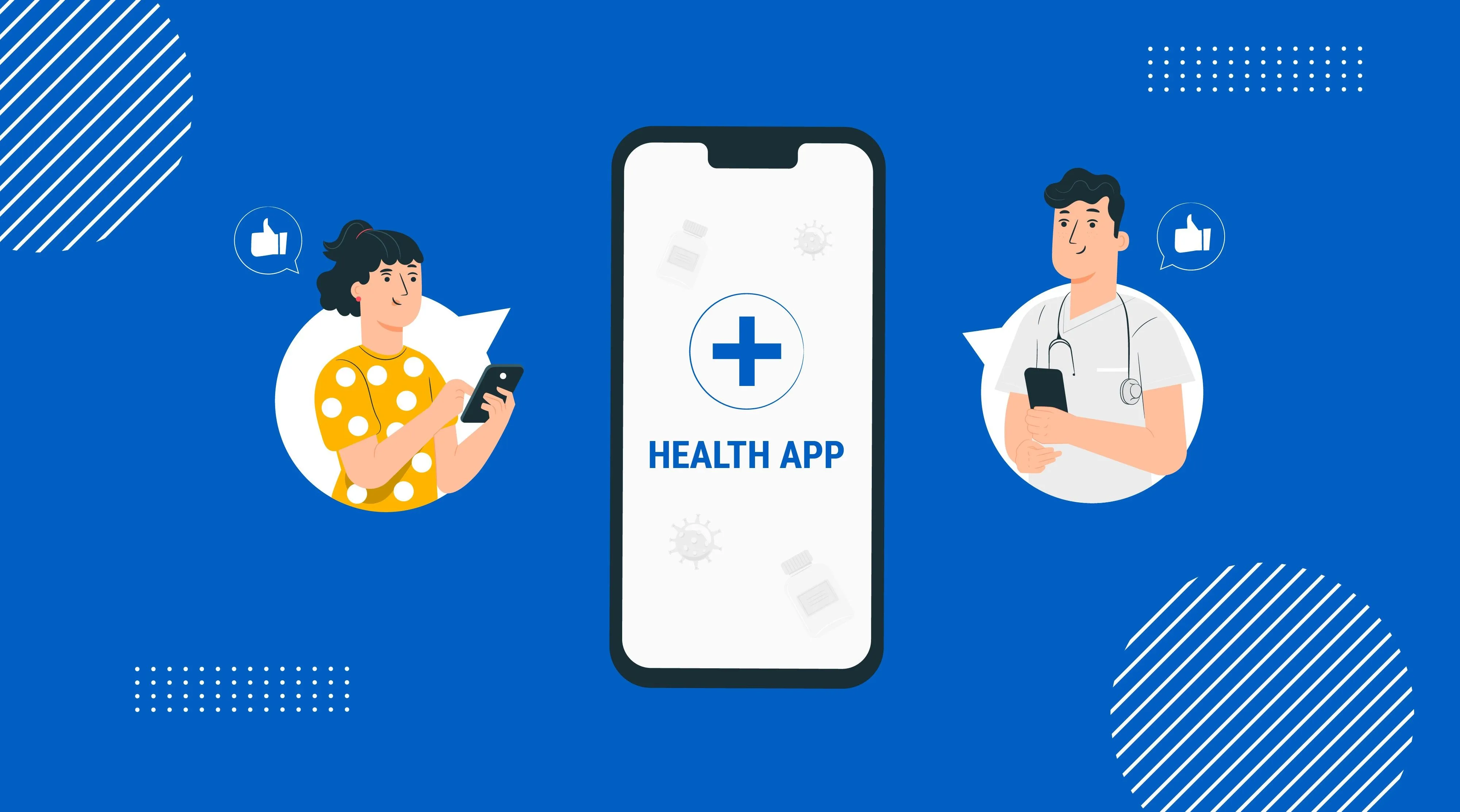
If you want your app to be successful, one of the most important things is to ensure that design and functionality work together. They have to solve the problems of your users and address their pain points.
Depending on your targeted audience, think about functionality to include. So if you create an app for medical organizations such as medical centers, hospitals, etc., make sure that patients will have access to their records (visits, recommendations, appointments, and so on). When developing telemedicine apps, it's initial to add video-conferencing features. Medication apps are useless without a notification system.
Still, mind that even if your app offers a bunch of useful features, only the main ones can be placed on the home screen. Otherwise, lots of clutter will lead to frustration and choice upon a more simple app.
Step #4: Navigation
If you want your app to be widely adopted, clear navigation is a must. It should speed up the process of discovery and use. For example, a survey conducted on behalf of Stanford Medicine states that 62% of the time devoted by a doctor to each patient is being spent in the EHR. You can address this issue, offering doctors a more convenient, faster way of accessing and dealing with health or medical records. We did that for a recently developed Uber-like app for doctors, so you are welcome to read about it here.
The key point here is that your app has to be quick enough and have a clear navigation structure. So make sure that all the important information is on the surface, and your users won't lose their precious time looking for what they need for hours. To do so, adhere to the 3-click rule, which states that any information in your app should be accessible in three transitions.
Step #5: Colors
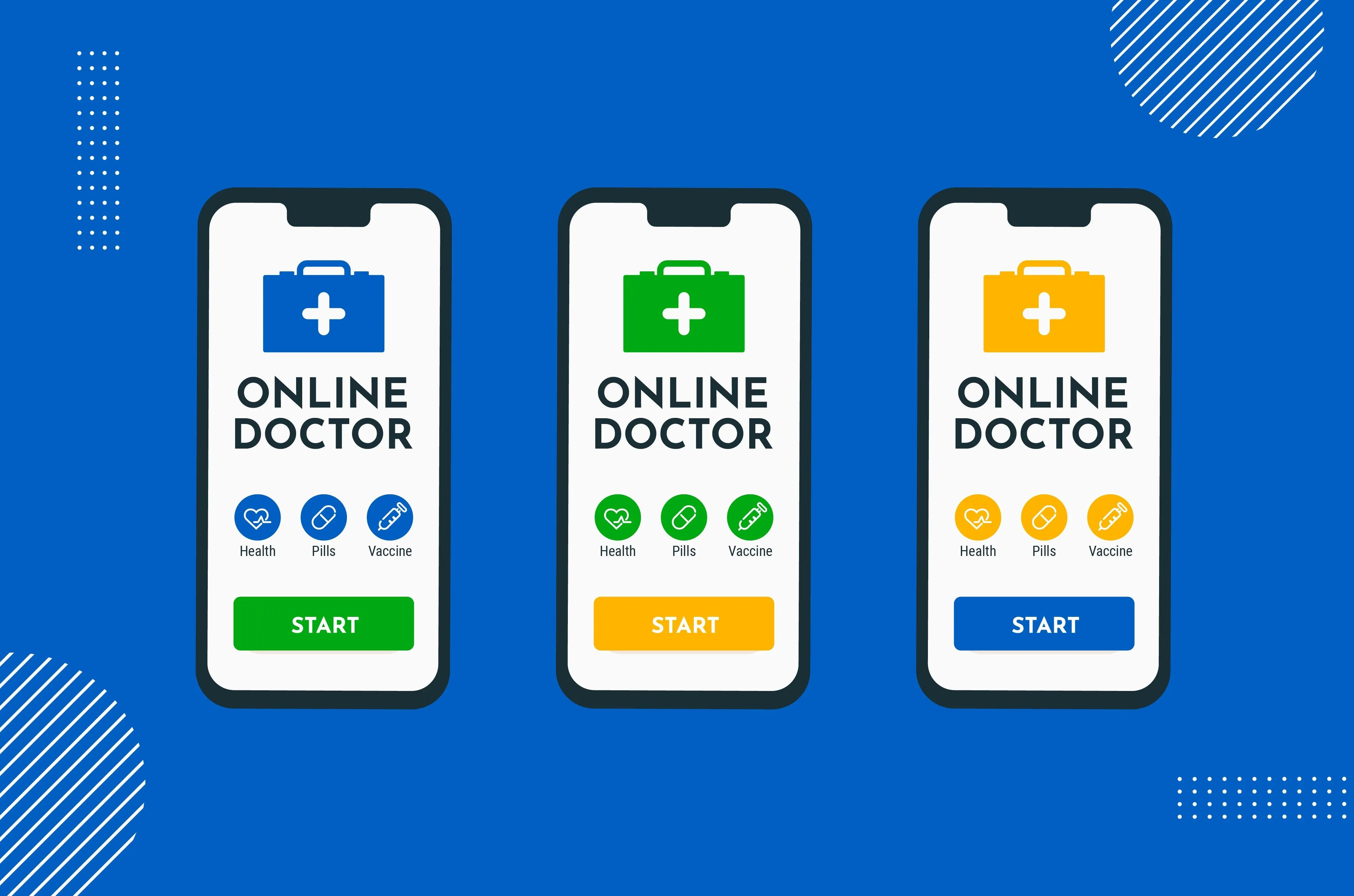
In the majority of cases, colors used in healthcare apps are neutral. These could be light shades of blue, green, grey, etc. When it comes to the background, the choice is usually upon white. It is so because the app should not look too vivid, irritating the user. For this reason, the choice of such colors as red and yellow is really rare.
Still, when looking at the diversity of healthcare apps, we can see that there are no restrictions at all. The only rule to adhere to is to create a positive, sometimes calming impression, as we did in the migraine app described below.
Step #6: Personalization
In recent years, the personalization of mobile apps has become one of the key drivers for their success. And this fact is proven by statistics showing that 33% of customers will abandon business relationships because of insufficient personalization. But what does personalization mean?
In terms of medical apps, it implies the provision of suggestions on the next action to take, gently guiding a user to the accomplishment of the desired goal and even further. To make your app personalized, research with identification and analysis of patterns in user behaviors is of the highest value.
Also, personalization can be presented through customization options, whether these are color themes (that was our case with a further discussed migraine app), interactive elements, etc.
Step #7: Accessibility
Adherence to accessibility rules is important in the creation of any type of app, but when it comes to healthcare ones, the importance is even of higher value. The thing is that healthcare solutions are more likely to be used by people with different impairments. Also, quite often these apps have elderly people among targeted users, so it is initial to address different visual and hearing abilities, as well as physical and psychological characteristics.
All this means that both app owners and developers need to take into account limitations their users might face and build the solution in a way to minimize the negative impact of these limitations. To do so, it is wise to rely on WC3’s Web Content Accessibility Guidelines, adhere to design accessibility rules, and use color blindness simulators.
Development for a migraine app at Emerline
Recently, our team has taken part in the development of an app that helps people who are prone to migraine. The idea behind the app was to offer a user a migraine-free life or to minimize the possibility for its occurrence through the analysis of three types of data:
- Environmental (weather — barometric pressure change, bright sunlight, and other traceable triggers)
- Behavioral (data provided by the user on a diet, sleep, activity, etc.)
- Personal (gender, age, etc.)
Taking advantage of Kotlin and Swift, our experts rebuilt the existing mobile app for iOS and developed the one for Android. We also worked on the creation of custom themes to allow the client the possibility for setting different color themes for the app and changing the branding elements.
After 3 month of hands-on work on UI, our team delivered to the client easy-to-use, pleasantly looking, intuitive apps for iOS and Android, each offering opportunities for fast and easy customization. Thanks to our work, the client gained a lot of business benefits, including:
- Ability to resell the app to any third-party service provider, with an opportunity to implement their branding elements and set a color theme accordingly.
- Provision of users with the solution that looks good and is easy and pleasant to interact with.
- A precious opportunity to reach a wider audience by offering versions for two major platforms: iOS and Android.
- Confidence in the fault-free operation of the version for iOS.
You have to agree, getting all these business advantages in a short period of time is a really good thing you can do for your business, and for sure, we are always here to help you with that. Feel free to contact us for more information, free consultation, and let’s make your brightest ideas come to life together!
Published on May 14, 2023

