2025 UI/UX Design Trends and Emerline’s Design Strategy: Interview with the Lead UI/UX Designer Sergei Shilo
Table of contents
Design trends of the new year are always desired, as they are supposed to give us a taste of the upcoming experiences and offer insights into the changes of visual aspects of apps. It is believed that the awareness of the latest shifts in design is important to both creative specialists and customers who want to make their existing or desired apps meet the new demands, ensure the ability to stand out from competitors, retain customers, and attract new ones. But is that really so?
We’ve collected top trends that were mentioned in different overviews of 2025 UI/UX design trends on the web and asked Sergei Shilo, the Lead UI/UX designer at Emerline, to share his thoughts and opinion on their relevance and applicability to real-world projects.
You are welcome to read the interview with Sergei to learn about our viewpoint on design development, create a clearer picture of our values, as well as get a better understanding of the keystone principles and practices our UI/UX team tends to follow.
Our Design Strategy and the Attitude Towards 2025 UI/UX Design Trends
Sergei, to start with, can you briefly define your attitude towards the value of annually created articles on trends in design?
You know, the past few years of surfing through articles about the top UI/UX trends drove me to the idea that generally, these trends fall into three categories:
- Trends that take out a single parameter of some established design system or philosophy, and in this way stimulate the reckless use of this parameter by beginners and sometimes even more experienced people in design. When I say reckless, I mean that it is often applied without having an idea for what reason it was initially created, for what purpose it should be used, and what is its targeted audience.
- "Trends for dribbble", which application to the real-world projects is very questionable.
- "Trends of affordable technology", when some previously unattainable tech becomes available for the masses and for this reason immediately gets a status of a trending one.
So, answering your question, I would not say that design trends overviews are something you really need to look for if you are working in this sphere because you’ll face them anyway in your daily work.
Trends may have some value for professionals who deal with design indirectly, or people willing to start their career in design, as they allow them to create a picture of what’s happening in the sphere. But even in these cases, there’s a necessity in critical thinking and understanding of the reasons for the creation and real-world implementation of this or that trend.
To be able to think critically in terms of design, a person needs to learn the basics. When it comes to UI/UX, these are the basics of typography, coloristics, composition, interfaces, and analysis of a targeted audience. So when it comes to the professional growth of my team members, I would not advise against relying on trends for real-world projects, if there is no perception of what’s what.
Ok, and then what is that something that really matters for designers?
The answer is simple: it’s the needs of your users. For example, in terms of the analysis of the targeted audience, the basis is made up of interviews with end-users and distribution of questionnaires, creation of such artifacts as personas, CJMs, or Value Proposition Canvas. There’s actually a variety of ways you can do it, so you need to choose one that suits best your particular case, meets the client’s needs and goes in the line with your team’s UX strategy.
For example, at Emerline, we adhere to the Design Thinking methodology. What’s more, being a part of the LeverX that works in close cooperation with the SAP company, we’ve established AppHaus — a creative space designed to put end-users, customers, SAP representatives, and partners together to work on solutions, while following the Design Thinking methodology.
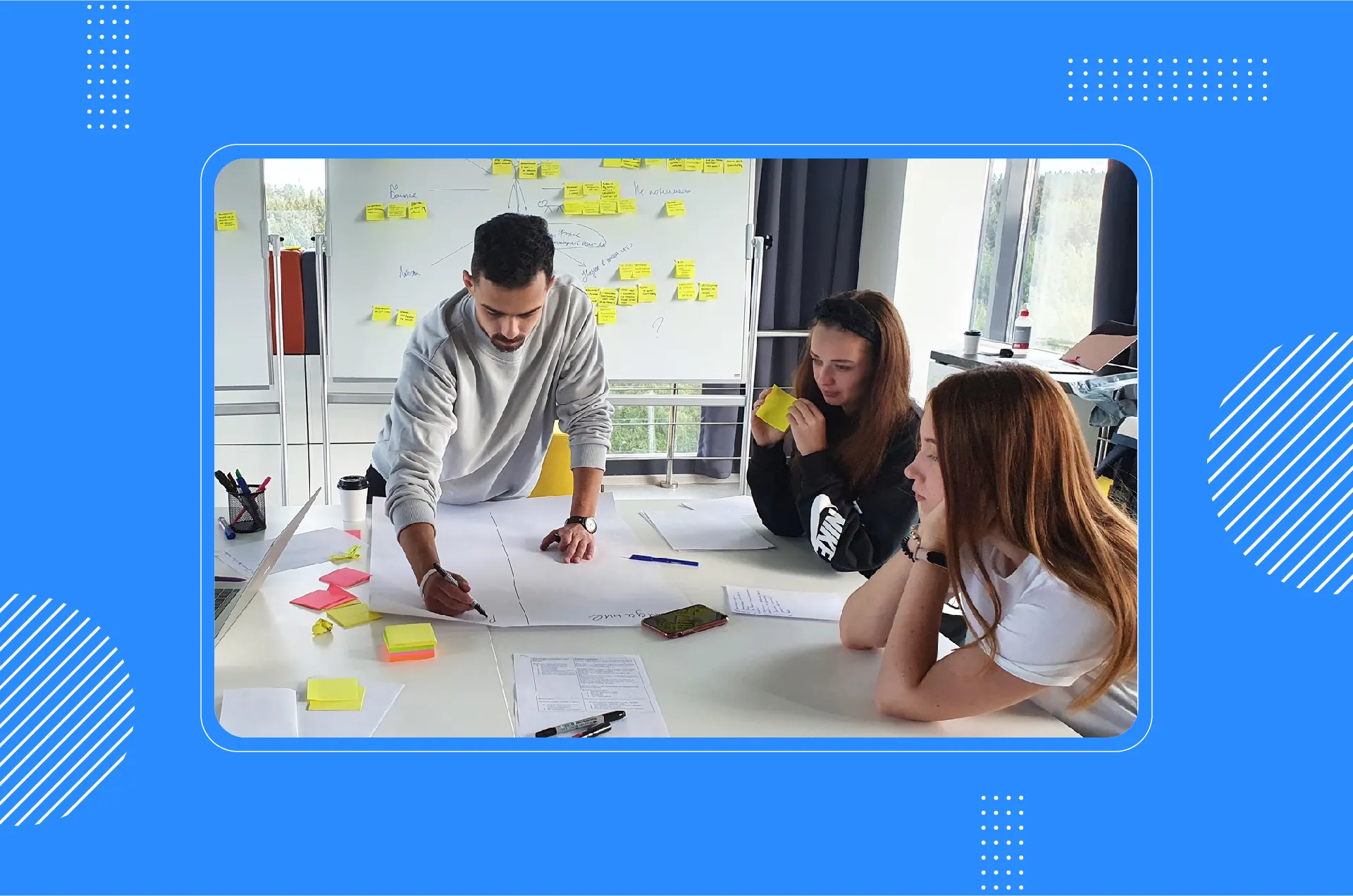
Emeline's team discusses a project at SAP AppHous
Also, when it comes to the definition of what matters in design, I refer to one of ten principles defined by Dieter Rams, a legendary designer who influenced on Apple design in general and personally on Jonathan Ive.
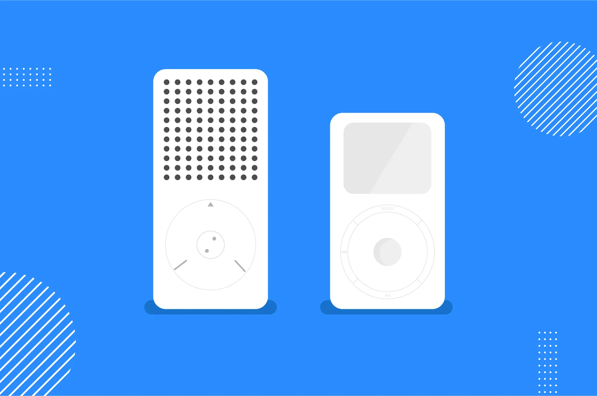
Braun product designed by Dieter Rams vs Apple's design of iPod
This principle is that a good design is long-lasting. But at Emerline, me and the team I work with, try to follow all these timeless commandments.
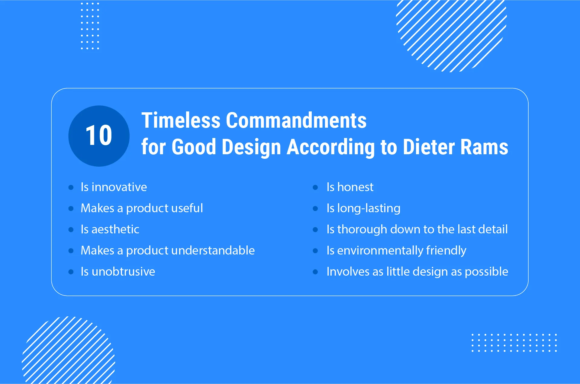
If you hear about them for the first time, I would strongly recommend you to get acquainted with these ideas here.
But can’t these principles work together with trends?
They can. My point here is that the vision of valuable design in our UI/UX team is more focused on proven fundamentals that allow the creation of user-centric designs, and trends play a secondary role.
For sure, if the client wants us to implement one of the trending design techniques, we can do it, but not as the key design consideration for the project. The key consideration should always be focused on usability to ensure ease and convenience in use for the target audience.
Ok, so now let’s look at examples of trading designs, so you can comment on their value and applicability.
Trend #1: dark mode
The dark mode is supposed to be implemented as one of the possible options, or as an alternative to a classic mode. So, what’s your personal opinion on this design trend?
Example of a dark mode from Dribbble
I have to agree, dark mode is trending, especially on dribbble, and can actually be easily applied to real-life projects. But I would not say that it is good for all projects.
If a product under development implies that end-users will have to read a lot of text material or scan huge volumes of numerical data, and the goal is to reduce eye-strain or to provide extra convenience for using the app at night, then it makes sense. So, a dark mode can be considered as an essential option for such applications as Medium, Apple Books, and other apps for reading.
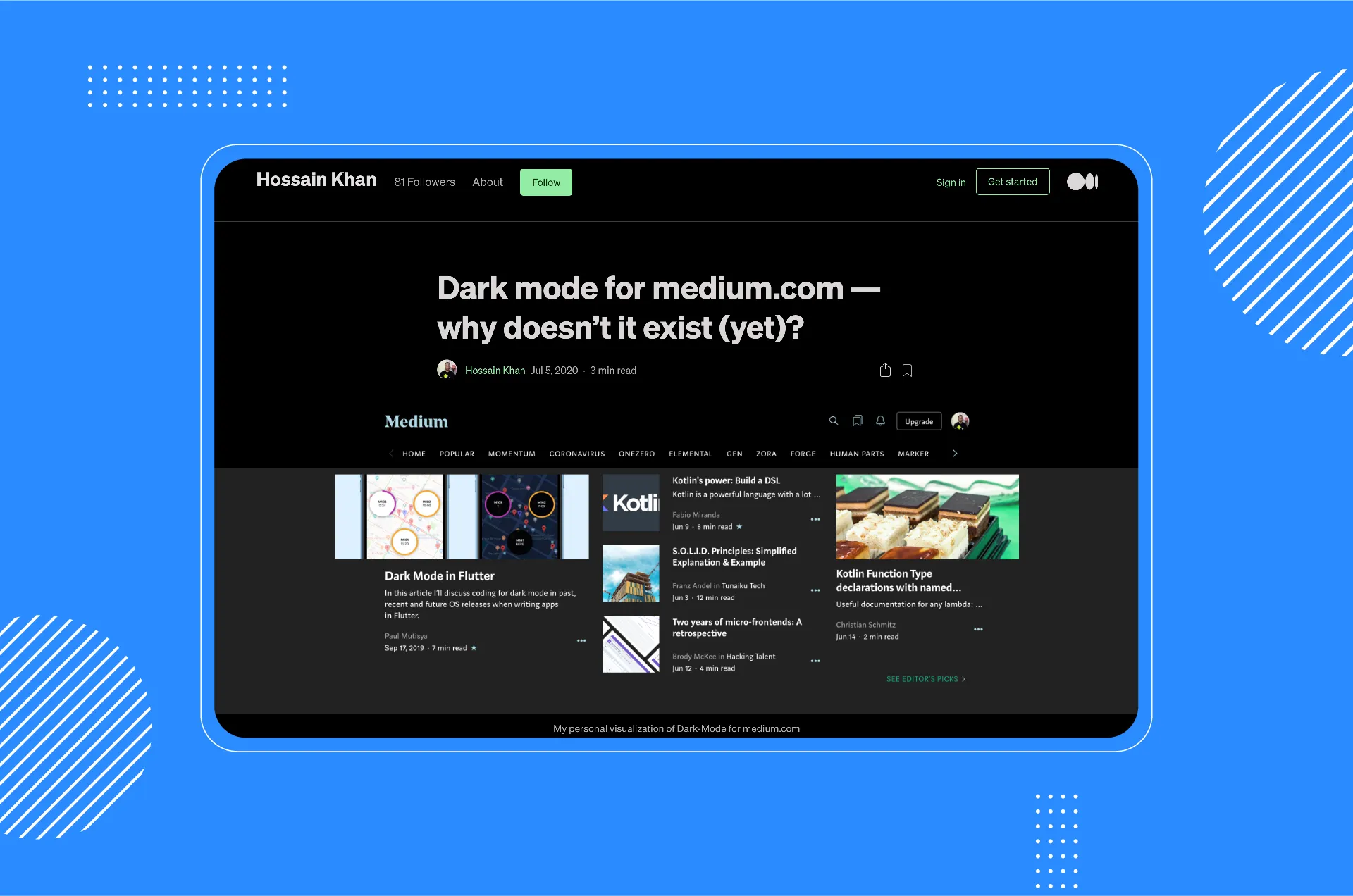
Dark theme for Medium
But in the majority of real-life projects, there is no necessity for the development of a dark theme. A more frequent situation is when a dark mode can be seen as a nice-to-have function. The one requiring money investments that generally does not go in the line with budget considerations.
Trend #2: 3D elements
According to sources, in 2025, there is a shift towards 3D designs that blur the line between the digital and physical worlds. Is it really so and what’s the attitude towards this trend at Emerline?
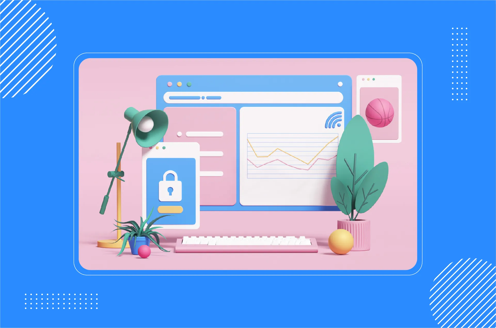
Example of 3D design from Dribbble
Yes, the implementation of 3D design elements increases in popularity, and largely thanks to the development of such technologies as AR/VR and the emergence of various web frameworks that allow the creation of 3D design elements.
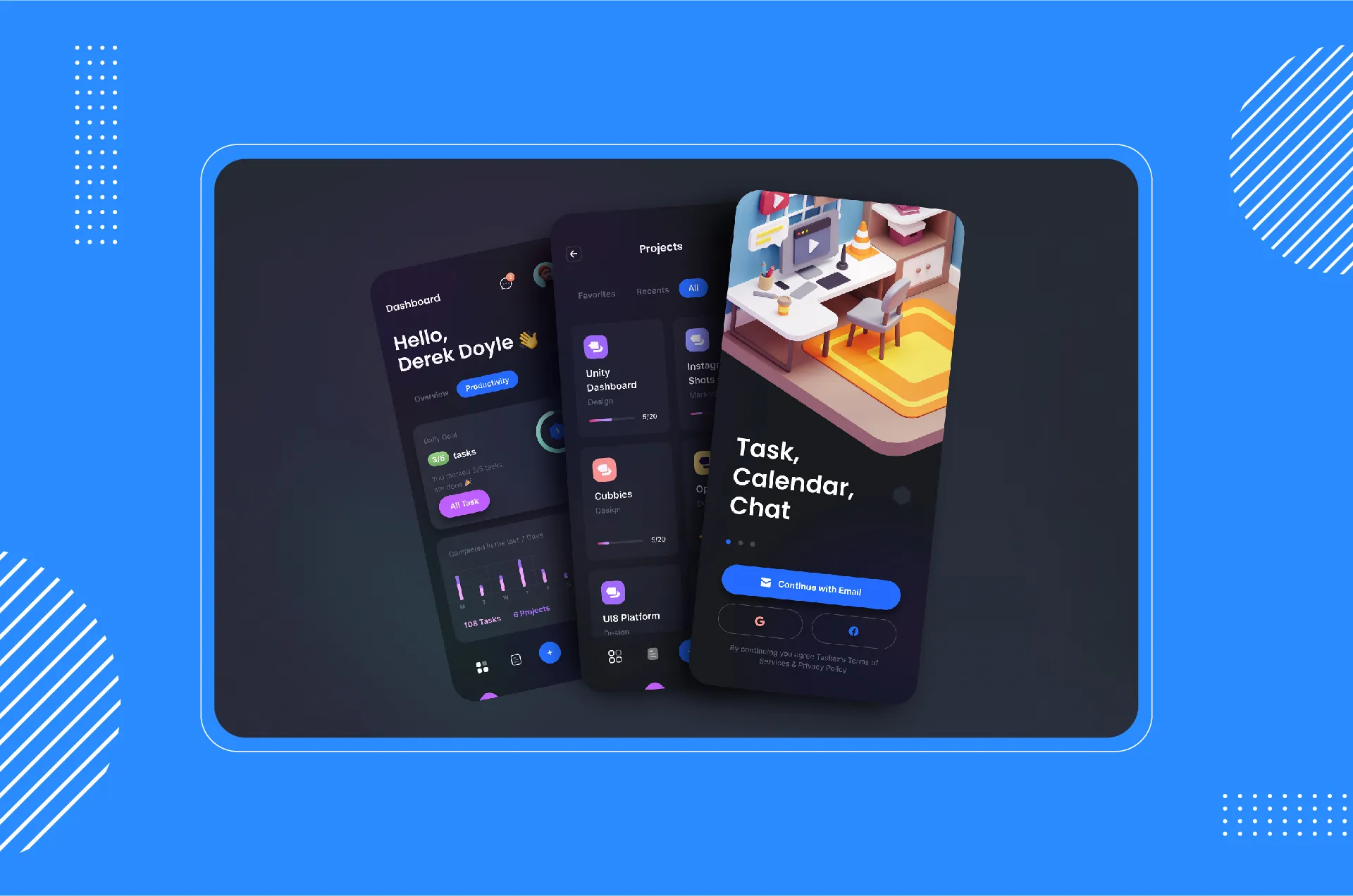
Because this trend is supported by the development of technologies that have the potential of taking UX to the next level, our team considers this direction as a prospective one and we have already taken advantage of 3D design in the GoDog app. There’s an AR mode that allows a user to interact with 3D models of a dog and its owner. You can also find some examples of 3D illustrations created by our 3D specialist Uladzimir Makhnach at our Dribbble account.
Trend #3: voice user interface (VUI)
Even though there are still quite a few examples of VUI use (only those belonging to giant companies such as Google, Apple, and some others), can we name it a trend?
For sure. This technological trend is the reasoned step in UI development. Because it offers extra convenience in use by freeing your hands, it will definitely pave its way for wide use and implementation.
Being a part of Emerline’s UI/UX service, I can say that we are looking for VUI projects, and would be happy to implement this trending technology.
Trend #4: wild and neon color combinations
The defined goal of using wild and neon color combinations is to make an app get noticed. Would you recommend trying it?
Example of design in neon colors from Dribbble
In recent years, we saw a bunch of movies, shows, not mentioning the Cyberpunk 2077 video game, and I see this trend as the continuation of these. So when it comes to its application to real-world projects, I would say that if a client’s targeted audience shares and admires the idea of cyberpunk, or such color combinations would somehow allow conveying the idea standing behind the brand, then why not?
Trend #5: soft shadows, layers, and floating elements
What are your thoughts about the trends on soft shadows, layers, and floating elements, which are supposed to enhance the depth of created elements?
In my opinion, this is exactly the case of ripping out one parameter, and not just from a single design system, but from the context of the interface development that took place for the last 20 years.
Knowing this context is crucial, as it allows seeing the direction in which UI development moves. So, let's take a brief look at how attitudes towards UI changed over the last decades.
- Skeuomorphism
This concept or philosophy roots back to the creation of the first Mac OS. Skeuomorphism is when an object in software mimics its counterpart in the real world in great detail, with shadows, gradients, and highlights: an icon depicting a real trash can used as an indicator of the storage location for your virtual garbage, an icon depicting a real folder is an indicator of grouped documents, etc. These solutions seem obvious to us now because they have become an integral part of our UI perception. However, such a detailed imitation of real-world objects makes interfaces visually overloaded.
- Flat design
Flat design was an abrupt, radical change of the course. It excluded overload but caused another problem - there were nearly no tools for visual separation of different objects (the simplest example of that is the need for separation of an interactive object from a non-interactive object). So in most cases, the only thing a designer could do is to rely on the patterns of UI perception established in times of skeuomorphism: sometimes it worked, and sometimes it didn't.
- The current state of design
The next stage of UI development is what we see in design now. It is a gradual return of certain parameters of skeuomorphism (real-world depiction of objects): an attempt to provide good affordance without overloading the interface.
Now, we are getting close to the so-called trend of "Soft Shadows, Layers, and Floating Elements": the first parameter from the real world that has returned to the interfaces was the shadow. This comeback was dictated by the introduction of the Material Design system by Google in 2014.
The thing to stress here is that a shadow in Google's Design System comes together with such a concept as elevation.
The shadow in Google's Design System mirrors the real world shadow:
- If the object is high from the surface, the shadow is more distributed;
- If it lies on the surface - the shadow is very small in terms of the occupied area, but highly concentrated in terms of color saturation.
Everything that happened after is dancing around this basic concept and its stylistic variations. That's why in 2025, "Soft Shadows, Layers, and Floating Elements" can hardly be named a trend.
To my mind, interface development and a gradual return of individual parameters of skeuomorphism is an interesting topic for a separate full-fledged article. So if you are interested to learn about the return of gradients, the inconsistency of Apple-style guides, Big Sur jambs, feel free to comment.
We will continue sharing our vision on design trends, concepts, and philosophies with you, so don't miss subsequent interviews.
Updated on Mar 12, 2025