Are There Any Benefits from Using the UX/UI Trends in 2025?
Table of contents
2024 was an interesting year in UI design. The difficulties that the world faced in the previous year have led to new trends and practices in this area. And 2025 is no different. As new tools and technologies arise, there is potential for UI to become much more innovative. Are there, however, any significant advantages from using all these trends?
Our UX/UI experts Sergei Shilo and Denys Riaboshtanov dived into the topic and examined in detail the practices and technologies that are actively labeled as trendy today to find out if they are truly beneficial.
The Most Useful UX/UI Trends
We looked through various lists of "trends" in modern UX/UI design and concluded that they may be grouped into three major categories:
Design Trends. It is common for design trends to focus on a single parameter from a design system and encourage mindless use of it among newbies and non-designers. The issue here is a lack of understanding of the reasons for creating such a parameter, how it can improve the design, in what context it is better to apply it, and what audience you should target
Dribbble Trends. You are unlikely to apply them to real projects for a variety of reasons. For example, it does not work or does not work correctly in the real interface; the interface does not meet accessibility standards. Or the use of certain techniques may be unprofitable.
Accessible Technology Trends. A previously hard-to-reach technology suddenly becomes available to the general public, and as a result, becomes trendy.
Therefore, the benefits of trends for UX/UI designers are questionable, since you are unlikely to use all of them, or if you do, you will regularly meet these techniques and approaches in your daily work.
Such articles can be useful for those new to design or other related areas: they will help form a general picture about current trends and techniques. But it is necessary to critically evaluate the data to understand exactly how this or that technique works, for what purposes it was created, how it will work in your particular case, and whether it can be applied.
We’ve listed the most useful design trends in terms of information and added links to various resources. We hope this will allow you to get a correct picture of what is happening (from our perspective).
#1 Data visualization
This is not exactly a trend, because creating a user-friendly and representative data visualization is one of the major UX/UI designer’s tasks.
Edward Tufte's book “Representing Data and Information” will help you dive deeper into the custom solutions in the context of data visualization. Although it was written back in 1990, it gives an understanding of the fundamental nature of the issue and introduces the variability of solutions on the example of different eras and countries.
Various trends often advise "getting rid of the excess" for better data visualization. In this case, the authors talk about such a basic interface parameter as information content, one of the key principles of which is “getting rid of the excess”.
You can find more details in Ilya Birman's book "User Interface", which is a must-read for all novice designers and other people who are interested in design.
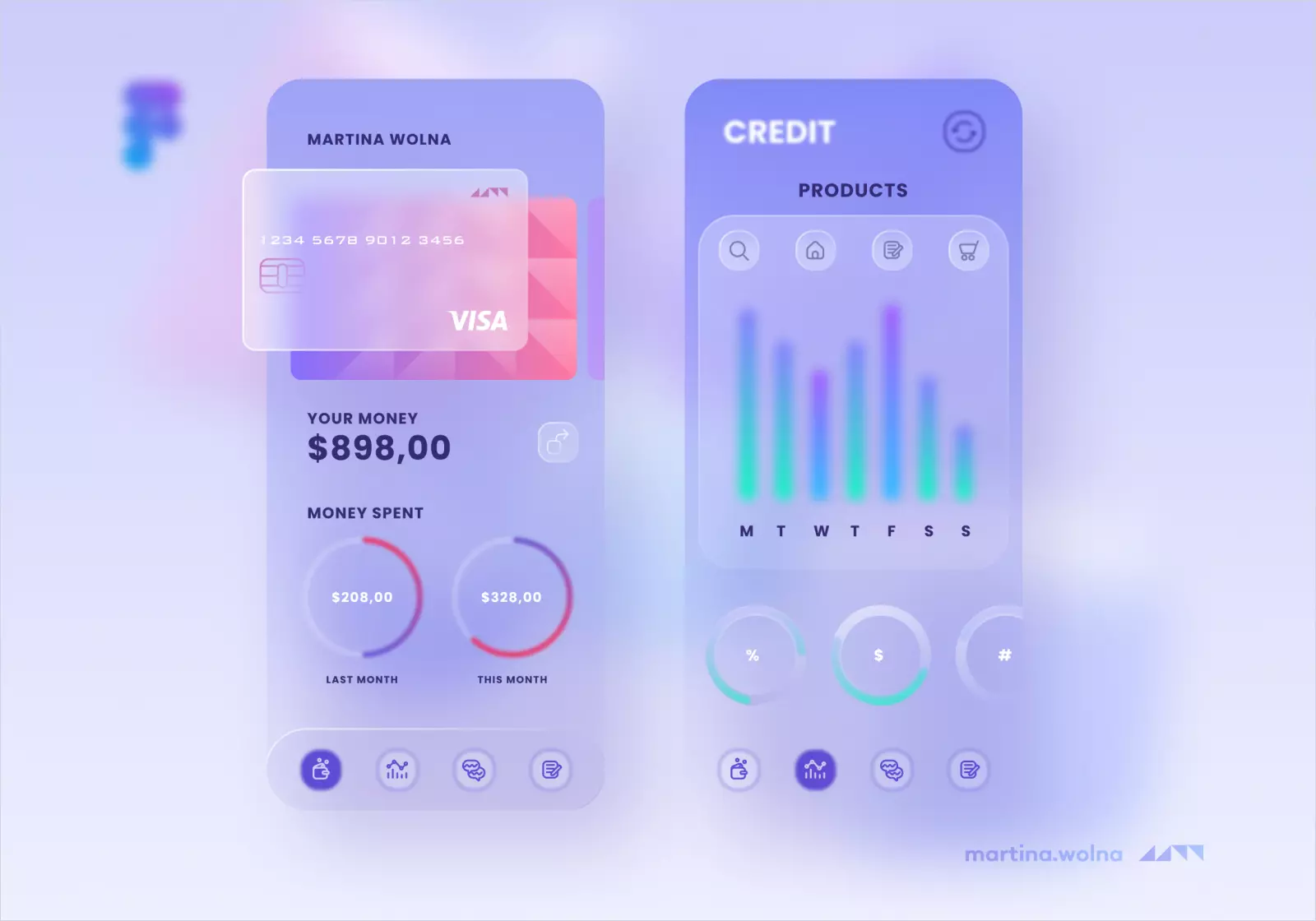
#2 Glassmorphism
Essentially, the main aspect of this trend is a semi-transparent background with blurred elements. Today it is called the new standard, but this popularity is easy to explain: such giants as Apple and Microsoft use glassmorphism.
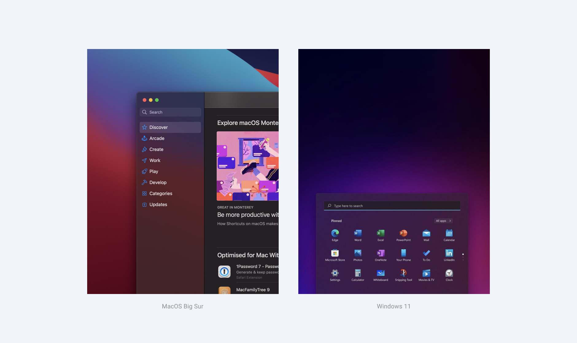
It allows you to:
- make the fill of the overlay element contrastive compared to the background, even if the background color is non-uniform or dynamic;
- keep the content inside the floating element contrasting and well-read with the correct selection of the degree of transparency and the blur level of the background.
Let's look at the example of using glassmorphism in an interface.
This technique is quite aesthetic and versatile. A similar functional effect can be achieved by separating an element with a shadow, different border and fill colors, or all of the above.
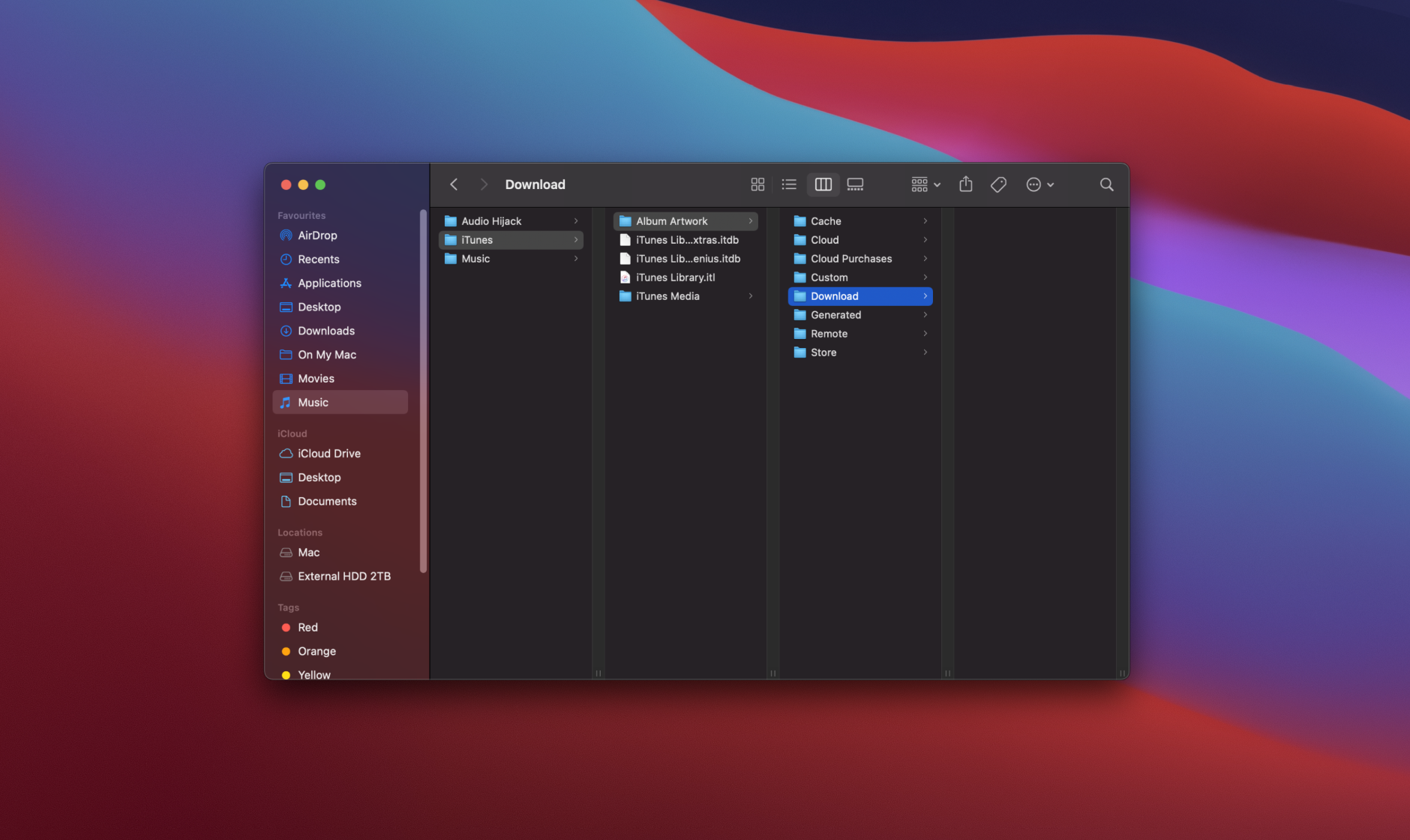
What determines the use of glassmorphism is the context, the purpose of such design, and the target audience. For example, Apple in its Finder program uses this effect only in the left menu. The other part which is stodgy with features is located on an opaque uniformly colored background.
#3 Dark mode
The dark mode was trending last year, but it seems to be fading in popularity. It is worth noting that dark mode was popular thanks to Dribbble.
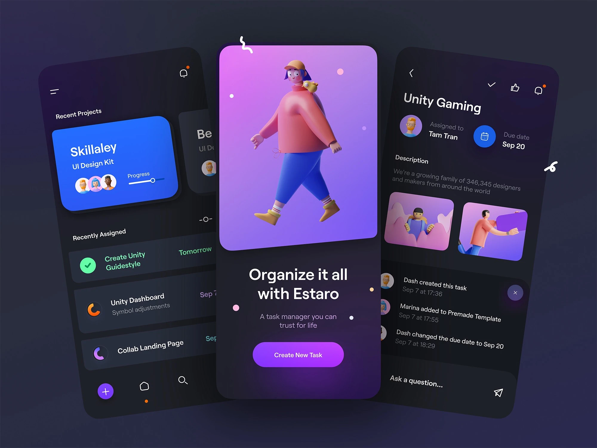
You can use this trend on real projects, but not in all cases. When choosing this trend, it is necessary to take into account the needs of the end-user. You should use a dark mode if your solution involves reading long text materials or processing a large amount of numerical data (for example, a solution for tracking the stock market), and your goal is to reduce user eye strain in a dark room. Moreover, it’s a must-have feature for those software solutions.
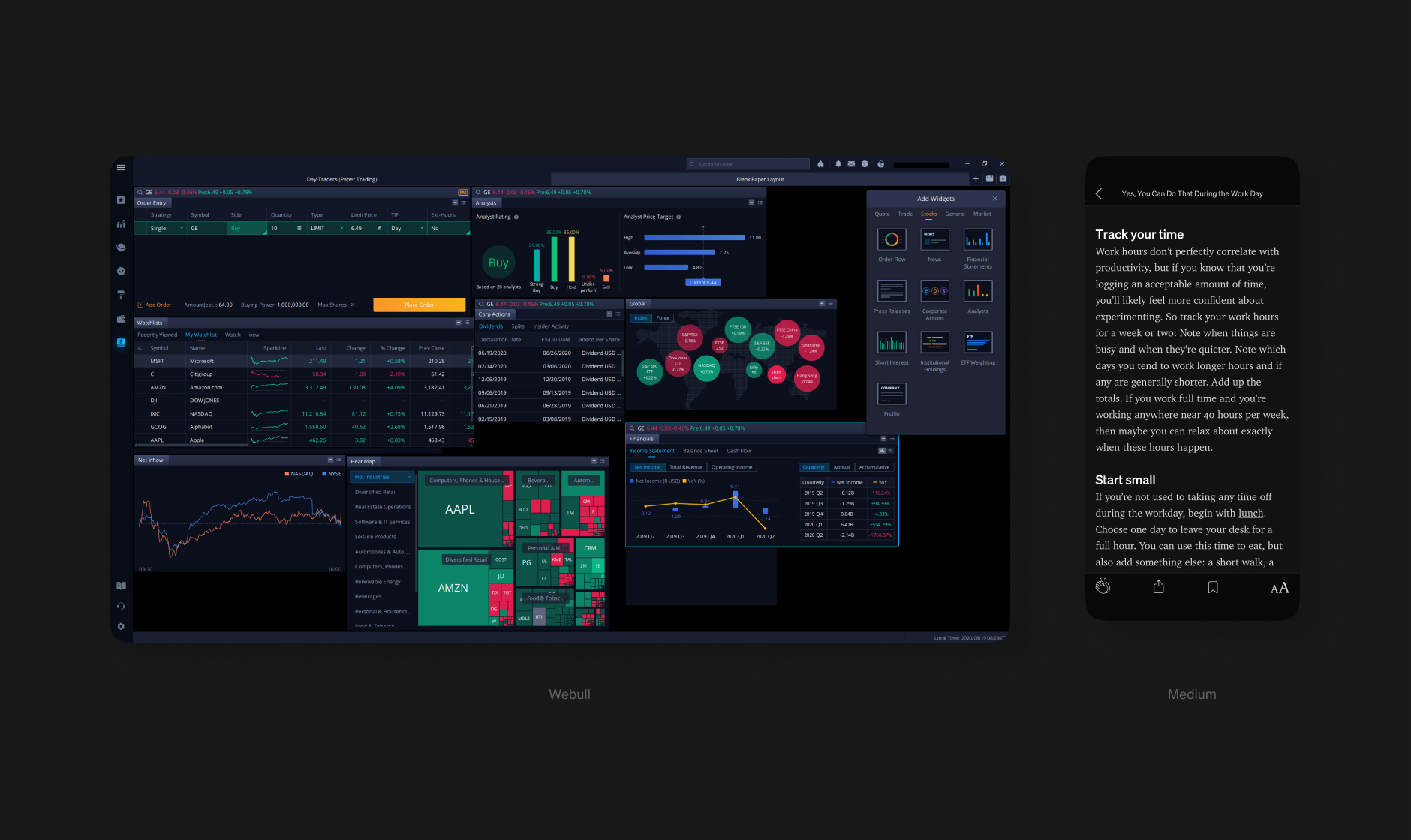
However, there are not many examples of projects where you need to use a dark theme. A dark mode is most often a nice-to-have feature, and the majority of startups and small companies can’t afford it. Therefore, you should make a decision based on the needs of the end-user and business, taking into account the current state of the market.
#4 3D models and VR/AR
3D models are a good example of the affordable technology trend. Today, many new plugins for Figma are appearing, many UX/UI designers are learning the basics of Blender, and apps like Spline are making 3D objects and animations even more accessible. That is why 3D models become commonplace in interfaces.
As for VR, we can hardly call it trendy in 2025. Different VR devices are not in high demand一 that’s why companies are in no hurry to develop software and games for these devices. Tech experts are more optimistic about the metaverse development. Thanks to blockchain technology, they can create a virtual shell for a wide variety of online services in any format.
Our team is actively developing in the direction of 3D design. We already use it in the GoDog app that supports an augmented reality mode. It allows the user to interact with 3D models of the dog and its owner. In our Dribbble account, you can also find examples of 3D illustrations created by our 3D specialist.
#5 Design systems and style guides
As for design systems, let's first define the term. A design system is a complete set of design standards, a description of how they work, and code documentation. The style guide or component library is an integral part of the design system, but not the main one.
Why do we draw attention to this? The answer is simple 一 when they talk about a design system as a trend, they often mean a component library or a style guide, which is really easy and convenient to create today.
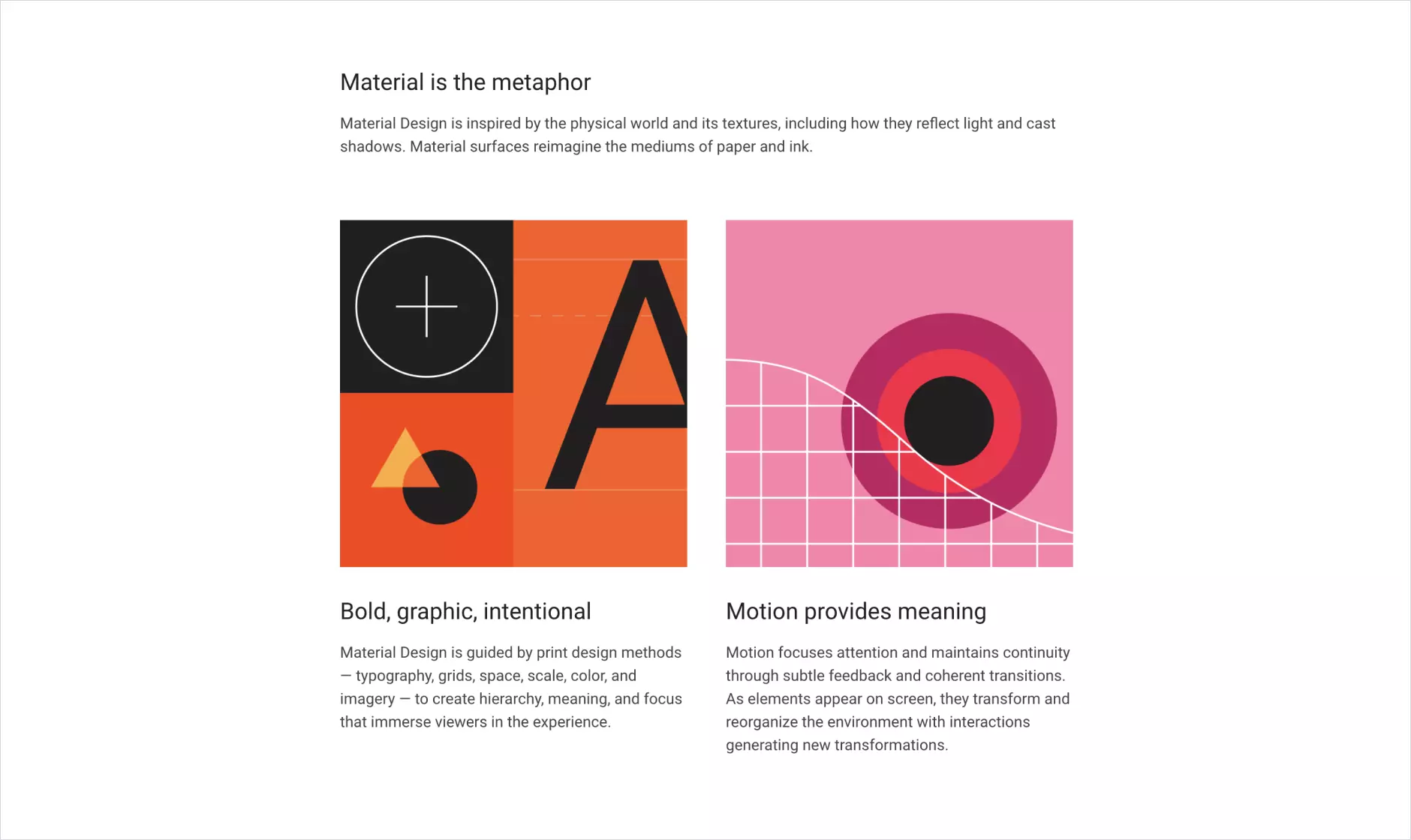
Many designers, having got used to the usability of component libraries, can no longer imagine working without them even on small projects. This trend will result in the systematization of product development.
However, if we are talking about design systems with a well-thought-out concept, described behavior patterns, code documentation, etc., it’s getting obvious that most products do not have such systems.
And they may not even need them. Today, design system maintenance and development is a time-consuming processthat makes medium and sometimes large businesses invest unjustified resources. But with the constant development of software for designers and front-end developers, perhaps in the future, even small solutions will be more affordable.
#6 Scrollytelling and scroll-hijacking
There is a fine line between customization of website behavior during scrolling and the so-called scroll-hijacking. The first approach is actively gaining momentum as an add-on to the website or app's usual behavior. A good example is the Google store, where products are often presented through a story.
The second technology is losing popularity today, scroll-hijacking destroys the user experience. In addition, most scroll-hijacking solutions are expensive to implement and maintain.
Look at the example of scroll-hijacking from Reputation Squad.
#7 Dynamics and animation
Dynamics and animation are used more and more often: many solutions not only have illustrations but also animate them.
Today, digital products increasingly include dynamic elements, for example, when moving from one page to another, when loading data, or performing actions. However, designers should not forget about the user experience.
The following is a loading animation of the website of the Emerline.
Many studies show that even micro-animations, such as shifting a label when clicking on an input field, can pose a challenge for people with Attention Disorder (from 4% of the population to 20% according to various sources).
More details:
Material Design Text Fields Are Badly Designed
Designing Safer Web Animation For Motion Sensitivity
UI Animation: Please Use Responsibly
#8 Neumorphism
Neumorphism, being originally created for Dribbble, turned out to be a short-term trend. This is confirmed by the inconclusive results of its use in both medium- and high-load interfaces in terms of aesthetics, information content, and accessibility (object visibility).
In our article on Medium, you will find more information about why neumorphism has no future.
What Should You Pay Attention to?
Below you will find a list of modern UX/UI design trends that in our opinion will be popular in 2025.
Personalization
Today, many applications interact with users and adapt to their preferences. Where once this focus was extended to existing/new users, now with the development of artificial intelligence and machine learning, personalization is becoming deeper and more accessible.
Let’s consider Netflix and Instagram as examples. Through the analysis of user behavior, these sites generate relevant content and recommendations for them. Moreover, Netflix also personalizes film covers based on user interests.
Visual design is an integral part of this global trend. Switching the system to Dark Mode on a scheduled basis, switching from harsh colors to softer ones on iOS when Night Shift is enabled, and the ability to customize the interface in Jira to suit the needs of the company 一 these are the examples of personalization in visual design.
Google has taken a big step in this direction in 2021. The company has released a new version of Material UI for Android devices, and the main function of this version is the personalization of the interface.
Below is the promo video from Material You.
According to various studies, personalized interfaces have high efficiency and conversion rate. That’s why this trend has a future.
UX research
Based on our experience, we can say that it has become easier to sell UX research for projects. Today, CEOs of companies understand the need for this process and the benefits it can bring, as well as the importance of building workflows in such a way that they rely on real data already in the early stages of a project.
This data allows you to create strategies and make decisions on the project development. It is much cheaper to change strategy at the initial stage than at the design or development stage.
It is also worth mentioning that customers are now interested in UX research. We believe that this will become commonplace in the future.
How to Choose an Approach?
The designer should first and foremost consider the demands of the end-users. You should understand your target audience, its pain points, goals, and benefits that they want to gain. If you focus on these factors, you will create a good product.
At LeverX Group, we strongly adhere to the design thinking methodology. That’s why thanks to close cooperation with SAP, we created The AppHaus. This is a creative space where end-users, customers, SAP representatives, and our partners can work collaboratively on various solutions.
Want to enhance the visual appeal and improve the user experience for your technological solutions? UI/UX designers at Emerline apply their expertise to various types of solutions, including UI/UX for mobiles, web, cross-platform apps, as well as AR experience design. Book a free consultation with our experts and increase levels of engagement and satisfaction among the end-users of your app.
Updated on Apr 3, 2025
